Paper
The style shared by lukesteuber.com, Prior work and Downloads: a pale paper page, cut away to five colored sheets lying beneath it. This guide is built from the same sources those pages are, so what it shows is what they use.
Sheets
The sheets always lie in this order, and each site gives them the same jobs where it can. A sheet keeps its color in dark mode. Text on every sheet is ink, #151515. Tomato is a sheet, never a text or link color.
| Sheet | Value | Homepage | Prior work | Downloads | Ink on it |
|---|---|---|---|---|---|
| Sun | #f6c62b | About | The introduction | Each page’s introduction | 11.3:1 |
| Blue | #718ed0 | Featured | Cognixion | Bands that explain the product | 5.6:1 |
| Tomato | #e64b34 | Prior work | Tobii Dynavox | — | 4.7:1 |
| Leaf | #6db07c | Elsewhere | Avaz | Download sections | 7.1:1 |
| Lavender | #cab1d7 | Contact | LanguageCraft | — | 9.4:1 |
Paper is #f7f6f1 with ink #151515 (16.9:1), muted text #55544f (7.0:1), hairlines #d9d7cf and hover #efede6. Under dark paper (#16171a, ink #ecebe6) the sheets stay as they are. Downloads also tints two of its papers: Apps #e3ebf9 and For developers #d8ead6.
Telling them apart
The sheets have to stay clearly different from one another for typical vision and under simulated deuteranopia, the most common color-vision deficiency. Distance is CIELAB ΔE, and deuteranopia is simulated with the Machado (2009) matrix at full severity. The closest two sheets are Blue and Lavender, at 30; against the paper, the closest is Lavender, at 27. A new or changed sheet has to keep every pair of sheets at 29 or more. Nothing may be told apart by a red and green difference alone: states and marks also differ in lightness, shape or words.
| Pair | ΔE, deuteranopia | ΔE, typical vision |
|---|---|---|
| Paper and Lavender | 27 | 33 |
| Blue and Lavender | 30 | 28 |
| Sun and Tomato | 34 | 69 |
| Tomato and Leaf | 34 | 96 |
| Leaf and Lavender | 34 | 61 |
| Paper and Leaf | 35 | 48 |
| Paper and Blue | 57 | 55 |
| Blue and Leaf | 57 | 70 |
| Sun and Leaf | 60 | 69 |
| Paper and Tomato | 62 | 85 |
| Tomato and Lavender | 68 | 78 |
| Paper and Sun | 73 | 75 |
| Sun and Lavender | 90 | 93 |
| Blue and Tomato | 90 | 98 |
| Sun and Blue | 116 | 116 |
The torn edge
Where a sheet ends, it is torn by hand rather than cut (shown below at twice its size). The tear follows a soft wave with three scales of unevenness on it: a slow wander of up to 2.1 units, a wobble of 0.9, and a fibre jitter of 0.75, with a point every 2 units across a 600-unit width stretched to the window. Beneath the colored face, a pale rim 0.7 to 2.1 units deep shows the paper’s core: white at .62 opacity on light paper and .2 on dark. Its height is clamp(14px, 1.25vw, 26px). The light comes from above: a sheet’s lower edge casts drop-shadow(0 2px 2px rgba(0,0,0,.3)) drop-shadow(0 7px 9px rgba(0,0,0,.17)) onto what lies beneath, while an edge rising at the foot of an opening casts its shadow down onto itself, out of sight, and keeps only a hairline, drop-shadow(0 0 .6px rgba(0,0,0,.45)). Two tears alternate down a stack, so neighbouring edges never repeat one tear.
On the homepage the edges move. Each one drifts against a mouse and lags the scroll, deeper sheets further: up to 7px sideways per step at the window’s edge, and up to nine tenths of its solid band up or down. Like the layers of a paper cut as you move past it. Its box is 600 × 20 there: 14 units of tear and 6 of solid sheet behind it, with a border of the same sheet reaching further back, so the drift never opens a gap. Prior work and Downloads hold still and show only the tear’s 14 units. Nothing moves under reduced motion.
The paths come from luke-lines tools/paper_edge.py (TORN, torn_symbol). Copies live in the homepage generator, prior-work.html, the Downloads pages and the Android release toolkit’s CUT_RIM and CUT_FACE; this guide’s build fails if a copy drifts.
Closed sections and the pad
A closed section is the stub of a sheet torn off the pad: a strip of its own sheet at least 24px tall, with a torn lower edge lying over whatever follows. Stubs are layers like open sections, so no paper shows between them: a stub’s tear lies straight onto the section below it, and an open section hangs its own torn edge across the top of the stub below it. Only the last open section rises back up to the paper, through every sheet. A section folds into its stub as it closes and the stub folds away as it opens, both on one curve, a quarter to half a second depending on the section’s length. No words sit on the paper: a stub shows its section’s name only when pointed at or focused, and its accessible name and tooltip always say which section it opens, so the stack never depends on color alone; the top bar names every section too. The whole strip opens its section. In forced-colors mode each strip gets a ButtonText border.
Below the last stub is the binding: slivers of the list’s own paper, left by pages already torn away, so the list reads as the last page of the pad. The list ends on the pad’s card back, #b6afa2 (#2b2a27 under dark paper), with the page’s shadow along its edge.
The chaos critter lives under the binding. Its eyes peek out, follow a mouse and blink now and then; activated, the letters crawl out along the tear and back, flat, each letter on one of the five sheets and outlined in ink. Now and then, unasked, it makes trouble, picking what fits what is on screen: it tears a row out like a rough slip and pulls it away through the margin, or crumples the slip into a ball and kicks it off; takes bites out of a row’s top edge; tears up through a row from below; walks an inky trail across the list that dries away; peels a notch of a closed stub back over itself until it springs flat; or pokes its head out from under an open section’s top layer and scoots along between the sheets. Whatever it does is drawn over the page, never changes it, and clears up within seconds; pointing at or focusing a damaged row clears it. Smooshing it with a click or tap turns that visitor’s title to CHAOS! for good. It waits for a pause in scrolling and typing, avoids the row in use, comes at most four times a visit, and stays in the paper once the eyes or Escape send it home. Under reduced motion it never comes out by itself, and activated it appears once, still.
Type
One family, Atkinson Hyperlegible Next, from Regular to Bold: heavy and tight for the title and headings, plain for reading. The Braille Institute drew it for low-vision readers, so letters that are easily confused, such as I, l and 1 or O and 0, look different, and that is the character it brings. lukesteuber.com, Prior work and Downloads all use it, each serving its own copy (/dev/stuff/fonts/, /luke/assets/fonts/, /downloads/assets/fonts/, with the OFL licence), so no visitor’s browser asks another host for it; Helvetica Neue stands in until it loads. Numbers that sit in columns are tabular.
Luke’s Stuff
Prior work
Minimal
Reading text is 1rem with a line height of 1.45 to 1.5, in measures under 70 characters.
The list is 15px with a line height of 1.4, names at 600.
Notes, roles and tags are .8 to .9rem in the muted ink.
Links
On the homepage and Prior work, a link inside a sentence is ink and underlined, like this one. A link that does something, such as Download, Store or My work, is blue: Downloads (#1e50c8, #a3c0ff on dark paper). Downloads keeps its links blue, since nearly all of them are actions. Names in lists are ink until pointed at.
Prints and slips
A picture or a sheet of paper laid on a colored sheet, such as Featured’s pictures and the Prior work record, is a print: paper behind it and a two-part shadow, 0 2px 3px rgba(0,0,0,.3), 0 8px 14px -6px rgba(0,0,0,.3). Smaller paper laid on a sheet, such as the contact form’s fields, casts the lighter 0 2px 3px rgba(0,0,0,.24).
Featured
Featured on the homepage is one row of pictures on the blue sheet, each with its name and a line beneath. The row runs out to the window’s right edge, so the next picture shows there, and the first lines up with the page. It moves on one picture every seven seconds, back to the start after the last; it waits while it is pointed at, focused or out of sight, and stops once someone uses its arrows or scrolls it. With reduced motion it doesn’t move by itself. A phone shows one picture and the edge of the next.
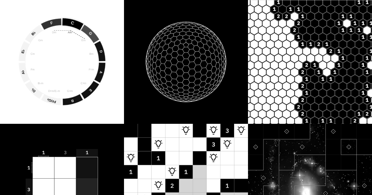 MinimalClocks, geometric puzzles, and experiments in simple interaction.
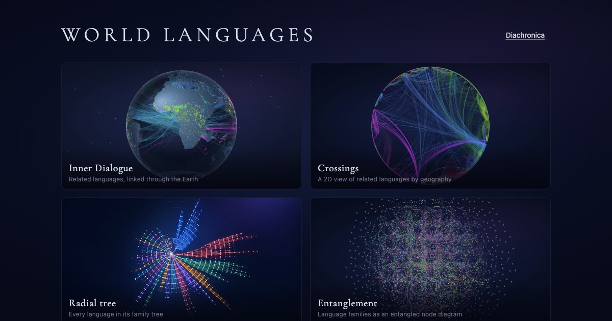 World LanguagesExplore how languages connect, branch, and become writing.
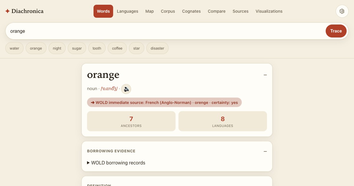 Diachronica — Word StoriesFollow words across languages, centuries, and changing meanings.
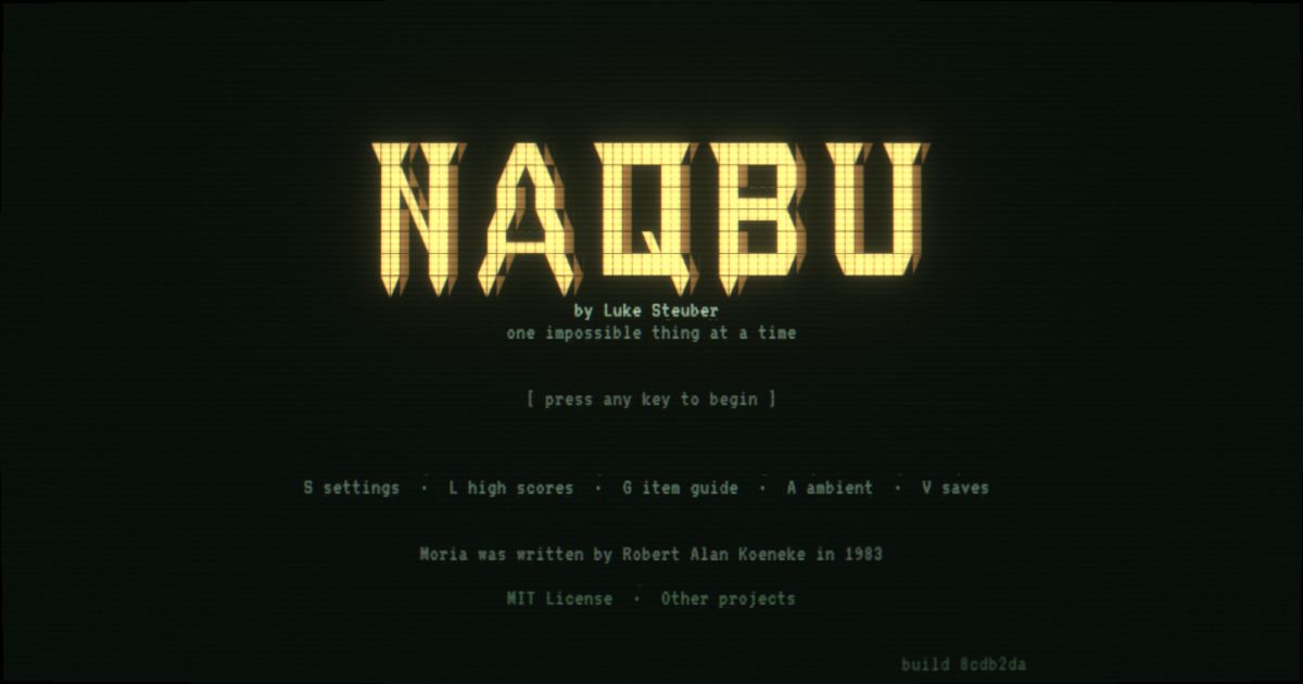 NaqbuA faithful text roguelike, with some twists.
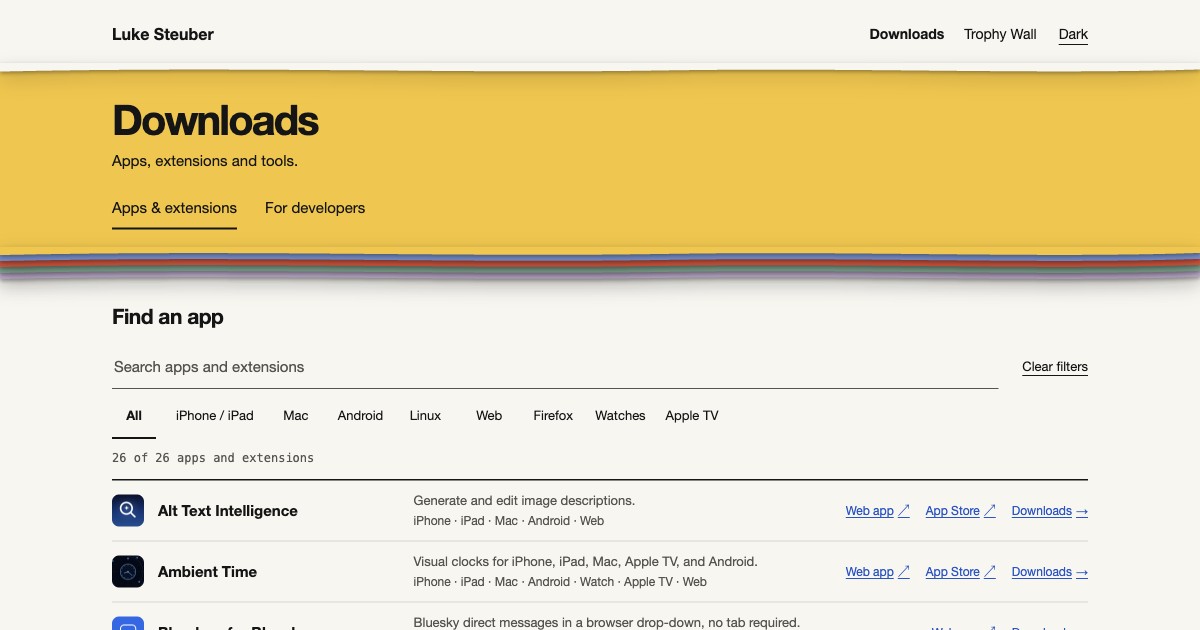 DownloadsApps, games, and other things you can install.
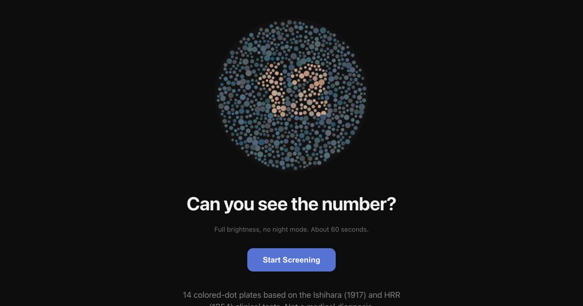 Colorblindness TestA real one: Free, with citations.
The record
Prior work on the homepage is one paper record on the tomato sheet. Each place has a strip on a shared run of years, in the color that place has on the illustrated page, with its dates also in words. A place with no recorded end begins in its year and fades. Work with a picture of its own shows it; borrowed logos are left off. The homepage’s build fails if any Prior record is missing from it.
Product, language and clinical work from 2014 to 2023, by place and year. The illustrated page tells the longer story, and my résumé (PDF) has the rest.
-
Cognixion
Director of Product and Clinical
December 2019 to August 2023Awards: FDA Breakthrough Device, Red Dot: Best of the Best, TIME Best Inventions 2025
-
Tobii Dynavox
Director of Product Management
June 2018 to January 2020 -
Avaz
Director of Clinical Research & Development
April 2014 to March 2018 -
LanguageCraft
Founder, speech-language pathologist
Founded 2014 -
Also
Clinical, community and research work




The floor
- Light is the default. One switch serves all three sites; the choice is saved as
stuff-theme-v1anddownloads-theme. - Every control is at least 44px in both directions, with a 2px ink focus ring.
- Motion answers a person’s action. The one thing that moves by itself, Featured’s row, waits while it is pointed at, focused or out of sight, has a pause button, and stays still with reduced motion.
- Forced-colors mode keeps every edge and state visible.
- No grids of cards: sections are sheets, lists are rows, a group is a strip or a record, and Featured’s pictures run in a single row.